Hey Peeps!!!!
I have some super most excellent most creative and colorful post for you today. Oh, yeah, and its informative too!!! (Excuse me while i catch my breath..........)
Aaaand I'm back!
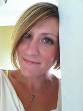
Today I have an interview with Regina Wamba, a super talented designer. She has designed all 3 of my book covers. She is sooo good at what she does and book cover design isn't all she does. Nope. Uh-huh. She does websites, logos, photography and book trailers. I'm pretty sure she'd knit you a sweater if you said please. She knows her stuff. If you need a designer you should check out her site.
http://www.maeidesign.com/
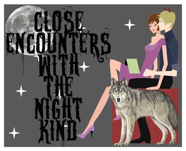
So my cover designs aren't enough to convince you? (really, I am totally offended) Fine. Here. Look at some more of her awesome work!
And now that you can see she knows exactly what she is doing how about hearing what she thinks makes great designs and what you can do to make sure you have a great cover and website!
Mae I Design is a full service design business that offers a variety of services. Can you tell us everything you offer?
Well, full lists of services are provided. But mostly I offer three categories Graphic Design, Website Design and Photography. A whole realm falls under those three from book cover design to search engine optimization.
Out of all these which one is your favorite thing to do?
Out of all my services I love photography, photo manipulation and book cover design or graphic design. There is a lot of creativity here and I enjoy it a lot! J
How did you get started in the design business?
I went to school here in Minnesota for graphic design and visual communications. I was always a painter and drawer and knew I wanted to do something with art as a career. I started doing freelance immediately after graduating while working through different graphic design positions. In February 2009, I took the leap and opened MaeIDesign and Photography. J
Is your knowledge of art and computers self taught?
Mostly. I actually taught myself photography, web design, and photo manipulation. As you grow as a designer you learn and explore.. that is what I have done. I tried some things I didn’t know, and loved them. J
Do you have a cover design that you have done that is your favorite?
Oh gosh.. I can’t say I have a favorite.. I enjoy them all and they all have a place with it’s own story. Every cover I do is enjoyable, and I do always do my best for the author. If something just isn’t clicking.. I think on it.. and try new things. J
What do you think makes a great cover design?
It’s a mixture of balance, color, and typography. It needs to have a good balance of space with a focal point, it needs a good balance of color. Too much or too little can make for an uninspiring cover. Finally the typography needs to bring in the cover as a whole. It should blend well with rest of the art and be legible from a fair distance.
Is there any one type of design or image that you think is overused?
I guess it depends.. I have seen the same image on a couple of covers for authors, and was confused by who’s book was who’s. I can tell you certain fonts can be overused and the image can be great, but the font or title can be uninspiring leading to a “Okay” cover.
Does cover design go in trends? If so, what is hot now and what isn’t?
In a sense.. mostly it blends with what’s “HOT” to read. Paranormal reads are on the high, so you’ll see a lot more fantasy like covers out there…
How long have you been designing?
Designing since 2005 and I’ve been an artist my whole life. J
What are the top three must haves when making a website for your business or book?
1. Always make sure your branding or look is consistent. It’s important for people to feel like they have visited one site, not three. 2. I always recommend that if you design a site, to have some sort of lead generator or way to engage. For example.. Facebook feed, or “WIN A FREE AUTOGRAPHED COPY OF MY BOOK!!” or something that gets people following you, or entering their email so you can keep in touch. 3. Always make sure your links and the functionality of your site are in working order. Your forms sending to the right address, your links are working, and your navigation goes to the right page.
What kinds of things should people stay away from when designing a website?
Well, I always discourage an overuse of images. A good balance of information and images is right. UNLESS you are specifically a portfolio site, but a good amount of text/information is always recommended. Always spell check your content. And again make sure that you have a relevant look and feel that flows throughout your whole website.
You are a photographer, so what would your dream photo shoot be like? Whose picture would you like to take?
I would say I would love to do some great fantasy shots.. like human unicorns..and ravens, dark and mysterious, fantasy and mythical.. I would need a huge studio and some serious equipment.. My plan is to have one of those one day!
Who’s picture? ANYONE WHO is WILLING! People who love photography and creative shots as much as I do!
What is the best thing about being a designer?
The ability to create and imagine.. and try new things. It’s very liberating.. and I wouldn’t trade it for anything!
The worst?
The technical stuff like contracts, statements, taxes. J
Where do you see yourself in 5 years?
I will have a location, maybe a website designer to do the websites and a studio for photography.
Where does your inspiration come from when designing a book cover?
The details and the story. The more an author is comfortable giving the story or details, the better my mind spins. I even dream about them!! I can sometimes pull together details the author never thought of!
SIDE NOTE: I honor every client I have and respect their privacy. In no way EVER do I share any information.
*I can second for this, I gave her Whiteout to read before she designed the cover and she was very respectful. I also gave her sections of Masquerade when when designing my book cover.
Have you ever had to deal with a difficult client? Someone who didn’t like anything? How did you handle that?
Oh yes, eventually I settle with them and make an agreement. We then go our separate ways.
What kind of books do you like to read?
I love historical romance, paranormal, and paranormal romance. BUT if it has good reviews, I am open to ANYTHING!
What is perfection?
When you get excited. Completely. When your whole body is just happy. You feel the connection when you look it over and say.. WOW.. THAT is good.
If you had to lose one of your 5 senses which one would you choose and why?
To lose? Probably my sense of smell..ONLY because I could live that. I wouldn’t want to, but I could deal. I would have issues if I could never feel my children’s hair, or taste the exotic foods I like to eat or listen to my family.. I could deal. Tough question!!!!
What is your favorite color?
Green. I love green. BRIGHT green!
Do you shop at Walmart? If so, what is the thing you buy most?
Haha.. Yes, probably groceries and birthday presents.. lol.
Please tell us how to contact you here:
612.568.6234
Thank you sooo much! What great questions!
What a great interview. I would highly reccomend Regina to anyone who needs design assistance. Thanks for stopping by today!!! Leave us a comment if you have something to say!!!
Oh and here's a little homework. That's right I said homework. It will only take a few minutes and I would VERY much appreciate it. :)
Please go to Regina's FB page and Like it. And while you are on her page, please go to the picture I posted on her wall of Cocoa (my little puppy-- awwww- who says no to a Puppy??) and leave a comment with the pic. Its for a contest and I could win a free cover!!! Me need covers. Regina needs Likes. You need homework. No? You don't. Well do it anyway. Like you have anything better to do anyway. Besides this is for a good cause. LOL.
Here's her FB link:
THANK YOU!!


Um, can she introduce me to that guy in the Caged Cover?
Seriously, that cover is H A W T!!!!!
Great interview, Cam and Great work Regina!!!